
From Liar's Kiss, by Eric Skillman and Jhomar Soriano, available for pre-order now.

THE ONLY SON COVER
As I think will be obvious to you, the important relationships in both these films are parent and child: in The Only Son it’s Mother and Son, in There Was a Father, it’s Father and Son. Those are definitely the relationships we’d like to focus on for the covers—probably to the exclusion of any other characters.
The shot that sticks out to Kim (the producer of this disc), is this moment from about halfway through:
This is a great mother/son moment, and the smokestacks in the background also do a lot of good work, hinting at the city/country contrast, and also emphasizing the working class roots of these characters (which are of course a big driving force in the story.) Here’s a better shot of the smokestacks:
So that’s one idea that we’d love to see you try, plus anything else that suggests itself to you, keeping that focus on mother and son in mind.
THERE WAS A FATHER COVER
Again, the main thing is the Father/Son relationship. A recurring motif in this film is the father and son, shot from behind at a distance:


Kim is very drawn toward that kind of visual (particularly that first iteration there, with the two walking together away from their house, the son with his school bag being a nice touch), and would love to see something like that in a cover. But again, that’s just one idea to try, we’re open to others.
THE SLIPCASE:
The most difficult part of any set like this is the slipcase cover, as we’ll need to somehow serve both films well without privileging one over the other. Here’s one idea that Kim has suggested, which I think could work pretty well: She’s imagining an empty room, lovingly composed with the shoji screens Ozu was so fond of, seen from the low, straight-ahead angle that Ozu loved to use. In the foreground, we see the red teapot that Ozu used in so many of his films. Here’s a shot of the teapot, and another (better composed, in my opinion) shot of an empty room--the teapot’s in there, too, but less prominently:

The idea being, it’s a domestic scene that’s entirely about the absence of characters, just as parent and child are physically distant from each other in both films.
One possible variant on this idea, if the empty room is feeling too spare, might be to include hints of parent and child, cropped just outside of the frame (so that hopefully the figures can be obscured enough to stand in for either parent/child combination): parent in the foreground, child in the background (i.e. the next room), to symbolize their separation from each other. This kind of relationship:
Or as I say, if you have another idea--maybe even something as simple as a dyptich, with one image from each film—we’re all ears.
THE REST
As we move further into the packaging, we can stray a little further from the “high concept” stuff that tries to encapsulate the entire film(s), and toward some smaller moments. I’d like to use those opportunities to create some fairly straightforward appreciations of Ozu’s compositions--almost, as you suggest, like film stills.
For example, there are a number of shots of laundry hanging on lines, flapping in the breeze, in The Only Son--I’d love to see something like that spread across the inside of the DVD wrap (underneath where the disc goes). If we don’t wind up using the smoke stacks on the cover (or even if we do, I suppose), an image of those would make a great disc label. Or, in There Was a Father, the images that immediately jump out to me are the umbrellas leaned against the wall and the lake where the boy drowns, or maybe some of the buddhist symbols Ozu keeps cutting away to. (I’ve included some images of all of that with this note.)
As you look through the film, keep an eye out for any of those kind of shots that speak to you, anything that you can visualize as a drawing. Jot down the timecode or a quick description of the shot and I’ll get you high-res stills as soon as the new master is ready.
While we do want to be respectful of Ozu’s compositions, I don’t think we need to be too slavish—obviously, we’ll be working with different size “canvases,” so the important thing it to be true to the spirit of the thing, while giving you some room to add your own artistry to the project.
STYLE
I completely agree with your instinct to aim for a limited color palate on these. I probably wouldn’t want to go strict black/white/grey, though: in the context of our collection, where we deal with so many black and white films, I like to make a distinction between films where the black-and-whiteness is part of the essential character of the films (i.e. most Bergman), and those where it’s more simply a function of the technology of the time. I think these films stradle the line a bit--we probably wouldn’t want to see any bright bold colors, but pale muted tones feel kind of right, somehow. I think those are the kind of palates you seem to gravitate towards anyway, so I trust your instincts on that.
Re: design, I’m imagining things fairly simple: full bleed images, plain unfussy type. I’d like to let the images speak for themselves, without too much “design-y” mediation. But again, if as you’re working some more overt structure seems to present itself, I’m flexible on all this.


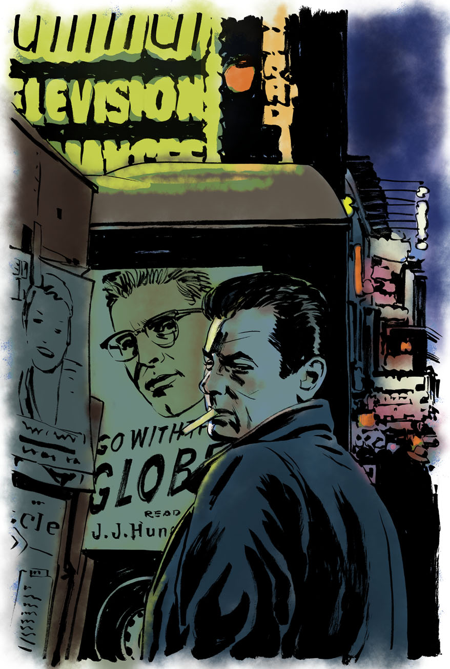
…As I mentioned, we've got some fairly specific ideas of what we want for the cover, mainly because we have some limiting restrictions from the studio we're licensing the film from. Specifically, they require that likenesses of both Tony Curtis and Burt Lancaster appear, and they must be the same size. Once you watch the film, you'll realize that this is, conceptually, an annoying requirement, because Lancaster's character basically towers over Tony Curtis in every way, both physically and in terms of prestige, power, etc, so the idea of putting them on equal footing is kind of a shame.
Our idea of a solution to this problem is to reference the very first scene in the film, where Tony Curtis is buying a paper from the newsstand in Times Square, and the delivery truck is behind the newsstand with the giant ad on the side for Hunsecker's (Burt Lancaster) column.
I don't think there's any particular shot in the film that captures exactly the idea, so you'd have to create it, but if we get Tony Curtis in the foreground and Burt Lancaster's face on the side of the truck in the background, I think we should be able to get both faces approximately the same size while still conveying a sense of Lancaster's importance and stature relative to Curtis. This idea has the added benefit of giving the opportunity for some nice street scene work in the background, (to give a sense of Broadway/New York), and the newstand/newspaper to reference the specific world the film takes place in (i.e. the world of gossip columnists.) Hopefully all of that makes some kind of sense? Let me know if anything is unclear or seems to you like it might not work.
(It's worth mentioning that I think the Huntsecker ads in the film itself feature his glasses but not his face… or at least some of them do. So you won't be able to copy the ads directly, but I think you can capture the feel of those ads using Lancaster's actual face, right?)
[…] Stylistically, this film is kind of noir-but-not quite--very little specifically criminal happens, no one ever pulls a gun or anything, but the overall tone of moral decay and the use of shadow and light all fit the noir pattern. So noir-y kinds of shadows are definitely appropriate, but we wouldn't want to go overboard in suggesting that kind of thing, if that makes sense… which is why I thought something painted, ideally with a nod toward some mid-century illustration styles, would be a good fit.


