
Basically, the big hurdle on this title was a clause in the contracts stating that the likenesses of both Tony Curtis and Burt Lancaster MUST appear, and both MUST be the same size. And given the power imbalance between the two characters in the film, the idea of having the two of them just standing there, on equal footing with each other, felt really wrong… but the solution we came up with in the briefs meeting, was, I think, a really great one… here's a description from the letter I sent to Sean explaining the project:
…As I mentioned, we've got some fairly specific ideas of what we want for the cover, mainly because we have some limiting restrictions from the studio we're licensing the film from. Specifically, they require that likenesses of both Tony Curtis and Burt Lancaster appear, and they must be the same size. Once you watch the film, you'll realize that this is, conceptually, an annoying requirement, because Lancaster's character basically towers over Tony Curtis in every way, both physically and in terms of prestige, power, etc, so the idea of putting them on equal footing is kind of a shame.
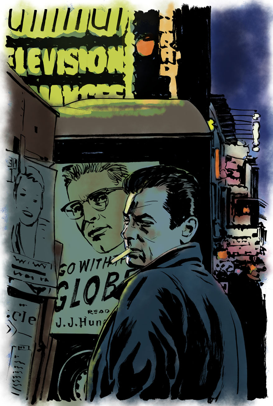
Our idea of a solution to this problem is to reference the very first scene in the film, where Tony Curtis is buying a paper from the newsstand in Times Square, and the delivery truck is behind the newsstand with the giant ad on the side for Hunsecker's (Burt Lancaster) column.
I don't think there's any particular shot in the film that captures exactly the idea, so you'd have to create it, but if we get Tony Curtis in the foreground and Burt Lancaster's face on the side of the truck in the background, I think we should be able to get both faces approximately the same size while still conveying a sense of Lancaster's importance and stature relative to Curtis. This idea has the added benefit of giving the opportunity for some nice street scene work in the background, (to give a sense of Broadway/New York), and the newstand/newspaper to reference the specific world the film takes place in (i.e. the world of gossip columnists.) Hopefully all of that makes some kind of sense? Let me know if anything is unclear or seems to you like it might not work.
(It's worth mentioning that I think the Huntsecker ads in the film itself feature his glasses but not his face… or at least some of them do. So you won't be able to copy the ads directly, but I think you can capture the feel of those ads using Lancaster's actual face, right?)
[…] Stylistically, this film is kind of noir-but-not quite--very little specifically criminal happens, no one ever pulls a gun or anything, but the overall tone of moral decay and the use of shadow and light all fit the noir pattern. So noir-y kinds of shadows are definitely appropriate, but we wouldn't want to go overboard in suggesting that kind of thing, if that makes sense… which is why I thought something painted, ideally with a nod toward some mid-century illustration styles, would be a good fit.
So with all that in mind, Sean turned in these sketches, the first a pretty straightforward rendering of our idea:
…and the second incorporating the sister--conceptually solid, compositionally excellent, but contractually a bit murky.

So the first above was closer, but we had a couple issues: we were concerned that Tony Curtis looked a bit too 'private eye' rather than slightly frazzled street hustler. We asked to replace the overcoat with a suit, and lose the cigarette. Also, we were hoping to get a little more of the newsstand in there. So Sean did a quick revise:

Which was pretty much spot-on! Our only concern was that the "Admiral Television Appliances" sign might interfere with the title treatment, so we asked him to cheat that over a bit in the final. Sean sent the pencils over before he painted anything to confirm, and as expected, they looked fantastic!

Sean decided to play around with the color scheme a bit, with really exciting results:

…and then the final painting:

Here's a few takes on type that I tried, before finally settling on a variation of some type from an old poster:


With this being the final choice:

I should say also that I was pretty happy with the way the rest of the package played out… sometimes when we start with an illustrated cover it's difficult to make the transition into menu or booklet design, but in this case I thought it worked well. First and foremost, Sean was able to paint two additional paintings for us, including this gorgeous wraparound for the digipak:

For the menus, I riffed off of the vintage type we used on the cover (I had to hand-draw those headers based on the original poster type), with a slight textural overlay to suggest newsprint:


And for the booklet, I was able to take advantage of the newspaper motif and put that front and center. Here's the wraparound booklet cover, followed by a couple interior spreads:


So there you have it!


19 comments:
Good to see you back. Another great looking package. I love those bad title boxes in the booklet.
This is a great post. It's always really interesting to hear about design restrictions set by the studio and how you guys have to overcome them. I also really have to mention how beautiful that drawing looks. I need to find more by this artist.
This post also made me really need to see the movie, so it's a great post.
This was instantly one of my favorite Criterion covers when it was first revealed. Excellent work by both you and Phillips, and a fun post!
Great work! Love the menus and booklet too.
It's interesting to see the evolution of an image
I don't know, I kind of think this:
http://www.imdb.com/media/rm4186938880/tt0051036
is the perfect workaround of the contractual limitations, no?
I really don't get those types of deals (why limit the aesthetic appeal of your product, even as an egotistical actor?), but I often think it can make for a great finished product, as was obviously the case with Phillips's excellent artwork.
Brilliant work
beautiful result!!
glad to see you blogging again :)
So good...
terrific post. always inspiring. I love how Criterion has so much to do with branding a film across the various touch-points, like the menu and booklet. Seeing the larger concept come to life is one of my favorite parts of purchasing a new criterion.
Thanks for the kind words, all!
anywhere one could buy these as posters?
To: "Girl With Interesting Hair"--not available as posters at the moment, but feel free to send a note to mulvaney@criterion.com and let 'em know you'd be interested in such a thing...
These are great! I was wondering who did the DVD art when I first saw it.
Amazing work all around...I know nothing about this film but will end up picking it up!
This is quickly becoming my favorite blog. I love Criterion and the design process. It is so refreshing and interesting to hear honest stories about working within the limitations imposed on your process. Don't get lazy and stop posting!
Anonymous: "Lazy"? I promise that when this blog goes fallow, it's not me being lazy--it's probably that I'm swamped with actual work!
(Well... except for those times I actually am being lazy.)
Is there a print available of the final cover? This is my favorite movie of all time and I finally have a midcentury house where I could showcase a great piece like this. Or better yet, is the painting available?
JJHunsecker--
Yeah, I can tell from your username you're a fan! No specific plans for a print or poster at the moment, but it never hurts to drop a line to mulvaney@criterion.com and let 'em know you'd want one.
Post a Comment