
Just noticed this: a very fun "commentary track" on Connor Willumsen's great short comics story "Out of Focus," from the upcoming volume 2 of Image's POPGUN anthology. If you follow comics, Connor is someone you'll definitely be hearing more about in the not too-distant future.
I had the privilege of collaborating with Connor on a short comics story (he drew, I wrote and colored), which I see he's uploaded to his personal site. (It's in the comics section, here; click "These Kids Today" on the left.) It's a bit small to make out the words, but if I get the okay maybe I'll put a more readable version up here when it gets a little closer to publication time.
And hopefully I'll have a little more comics-related news to share soon...
Sunday, July 20, 2008


Friday, July 11, 2008
Media Blitz 3(ish)
Not specifically about me or anything, but I liked this column on Criterion design at Paste magazine.
(Although, the Robinson Crusoe on Mars cover, "weird" and "inexplicable"? What do they have against Mona?)
(Although, the Robinson Crusoe on Mars cover, "weird" and "inexplicable"? What do they have against Mona?)
Friday, July 4, 2008
Blast of Silence
As I've blogged here before, Blast of Silence is one of my favorite Criterion movies of recent vintage. Criminally overlooked on initial release, it was exciting to get to finally expose it to a (hopefully) larger audience.
When it came time to design, the one thing that stuck in my head most about this film was the 2nd person narration throughout, which, to me, felt like nothing so much as old EC crime comics, which I'm a big fan of. So I had the idea that we could adapt a small segment of the film as a comic, with a cover to match. And that idea really started to seem prescient when we found out that director Allen Baron used to draw comics himself before becoming a filmmaker. (Some of his comics pages are actually hidden as an easter egg on the DVD, if you can find 'em!)
I briefly convinced myself that I could somehow be the guy who convinces Jack Davis to work in that old crime style he hasn't used for forty years, but ultimately that felt a little too nostalgic. Better to do something with a little bit more of a modern twist, that can really sell the ultra noir style of the film. And when you think "comics" and "noir," pretty much the first name that comes to mind is the great Sean Phillips.
Sean already had a connection to the film, too: in issue #4 of Sean and Ed Brubaker's great comic Criminal, there's a backup essay by Patton Oswalt on Blast, and Sean did an illustration to introduce it:

Knowing that he clearly "got" the film, he was the clear choice. Happily, he was available and interested. Here's the note I sent him:
Sean came back with a great variety of sketches, mixing and matching different figures and backgrounds.


He also generously sent us a bunch of his warm-up sketches, which were very helpful in fleshing out the rest of the package—you can see them throughout the menus of the disc, especially.
Of the cover sketches, there were two that stood out to us, and we asked him to expand on both. He sent us these:


We loved both versions, and ultimately the choice for the cover came down to the fact that the one had a more obvious space for space for a title treatment. (The other one wound us as the main menu of the DVD.) The red look was graphically strong, but, we felt that the cooler blue tones of Sean's original drawing for Criminal were more appropriate to the tone of the film, so we asked for that shift.) With that in place, I tried a bunch of title treatments, seen below...


...before settling on what became the final cover. All in all, one of my favorite projects—and Sean was a "blast" to work with. (Sorry, couldn't resist.) And I haven't even gotten yet to what was (for me) the most fun part of the project—the comic. Maybe I'll blog about that process at some point in the future.
And just to brag a little, here's a scan of my copy of the DVD, autographed by Allen Baron himself:

When it came time to design, the one thing that stuck in my head most about this film was the 2nd person narration throughout, which, to me, felt like nothing so much as old EC crime comics, which I'm a big fan of. So I had the idea that we could adapt a small segment of the film as a comic, with a cover to match. And that idea really started to seem prescient when we found out that director Allen Baron used to draw comics himself before becoming a filmmaker. (Some of his comics pages are actually hidden as an easter egg on the DVD, if you can find 'em!)
I briefly convinced myself that I could somehow be the guy who convinces Jack Davis to work in that old crime style he hasn't used for forty years, but ultimately that felt a little too nostalgic. Better to do something with a little bit more of a modern twist, that can really sell the ultra noir style of the film. And when you think "comics" and "noir," pretty much the first name that comes to mind is the great Sean Phillips.
Sean already had a connection to the film, too: in issue #4 of Sean and Ed Brubaker's great comic Criminal, there's a backup essay by Patton Oswalt on Blast, and Sean did an illustration to introduce it:

Knowing that he clearly "got" the film, he was the clear choice. Happily, he was available and interested. Here's the note I sent him:
As we see it, there are three ingredients that will be essential to this cover. First, Baby Boy Frankie Bono, obviously the central focus of the film, so he should definitely be represented. (Maybe holding a gun, maybe not?) Second, the city. This is the film that Martin Scorscese has called his “favorite New York movie,” and the setting is a large part of what makes it so great. I’m not saying you should put the Statue of Liberty in the background or anything (In fact, definitely don’t do that), but you should try to give a sense of the city. Third and finally, it should have that undefinable noir feeling, which must come naturally to you by now, right?
We love what you did with the illustration for Patton Oswalt’s essay, so we’re very confident that you “get” this film. The mood and style of that piece capture it very well. For our cover, we’d probably like to see a composition that’s just a little bit more dynamic, with Frankie Bono featured a little more prominently, but you’ve got the basics in there already. And as I mentioned before, we’d probably lean toward a harder-edged drawn style rather than a softer painted style, but if you’ve got some great idea that would work better in one style than another, feel free to try to talk us into it.
Like I said, we’d like to see a couple of sketches of possible compositions before we select a final cover, so just try to find a few interesting ways to combine those elements and we’ll go from there.
Sean came back with a great variety of sketches, mixing and matching different figures and backgrounds.


He also generously sent us a bunch of his warm-up sketches, which were very helpful in fleshing out the rest of the package—you can see them throughout the menus of the disc, especially.
Of the cover sketches, there were two that stood out to us, and we asked him to expand on both. He sent us these:


We loved both versions, and ultimately the choice for the cover came down to the fact that the one had a more obvious space for space for a title treatment. (The other one wound us as the main menu of the DVD.) The red look was graphically strong, but, we felt that the cooler blue tones of Sean's original drawing for Criminal were more appropriate to the tone of the film, so we asked for that shift.) With that in place, I tried a bunch of title treatments, seen below...


...before settling on what became the final cover. All in all, one of my favorite projects—and Sean was a "blast" to work with. (Sorry, couldn't resist.) And I haven't even gotten yet to what was (for me) the most fun part of the project—the comic. Maybe I'll blog about that process at some point in the future.
And just to brag a little, here's a scan of my copy of the DVD, autographed by Allen Baron himself:

Sunday, June 29, 2008
portfolio site redesign
My portfolio site has been in need of a major overhaul for a while now, but I just haven't had the time to work on it. Which means that the selection of work that had been up there was all at least a few years old. I still haven't been able to give it the face lift it really needs, but in the interest of getting some current work up there, I've done a quick and dirty redesign. Anyway, take a look, tell me what you think in the comments:
www.ericskillman.com
(If you've been to the previous site recently, (though I don't know why you would have), you might need to refresh your browser cache a few times to get it to load properly.)
The blog probably needs a new look, too, while I'm at it...
www.ericskillman.com
(If you've been to the previous site recently, (though I don't know why you would have), you might need to refresh your browser cache a few times to get it to load properly.)
The blog probably needs a new look, too, while I'm at it...
Thursday, June 26, 2008
The Furies
While I might not be quite as well-versed in Westerns as some—I know my way around the classics, (The Searchers; The Good, the Bad, and the Ugly; The Man Who Shot Liberty Valence; The Wild Bunch; etc), but I get a little hazy in the mid-list—I do have a fondness for the genre, particularly the iconography of the genre. So when The Furies showed up on the Criterion schedule, I jumped at the chance to design it. And once I had the chance to watch the film, I was glad I did, since it quickly became one of my favorite films within the collection.
Since this was the first "real" Western in the Criterion Collection (unless you count Young Mr. Lincoln), we felt it was important not to downplay the genre elements. But at the same time, it's a somewhat atypical Western, very dark in tone, so we didn't want to present it as something it's not. The Furies is often referred to as a "noir western," so I decided to try to combine the visual styles of those two genres. Once I found that hook to hang the design on, it was really just a question of execution.
Landscape plays a very important role in the film, as in most Westerns, (and particularly here since the plot revolves around the family's land), so I decided pretty early on that I wanted to include some aspect of painted landscape in this design. Knowing I was going to photoshop the end result, I didn't worry too much about color and just picked out some burnt umber-esque watercolors. Here's the original, un-altered landscape paintings:


I thought I'd try painting Barbara Stanwyck as well, though I was less confident I'd be able to achieve the likeness I wanted, since I am a little out of practice in watercolor. Here's the raw image there—you can see I had some trouble with the face.

The next step, of course, was to combine those into complete covers, and tweak the colors more toward where I wanted them.


On both, if you look closely you can see that I overlayed parts of the photograph that the painting was based on over the art, to try to firm up the likeness and give a (hopefully) interesting effect. Here's a little gif animation to demonstrate:

Apart from the issues with the likeness, I think those work alright, but they didn't quite have that element of "noir" that I was aiming for. I tried another tack, incorporating the high-contrast photography I like to use for noir films. (Or, actually, I had this photo-montage idea first, I just got so into the painting while doing the landscapes that I decided to try the figure on a whim at that point.) The ranch and trees in the background are pure black & white (i.e. no grey at all), but I did have to keep a little grey in the figure to keep it recognizable. Still, I think the "noir" effect comes through, right? (And if you look closely at the figure, you might just be able to make out a hint of the painted Stanwyck underneath the photograph, which I think adds a nice hint of depth and texture to that image.)

In all of the above, the title treatment, taken from the sign in the film ("The Furies" is the name of the ranch), was pretty much a no-brainer, though there was some question over whether it might not work better if we referenced the sign itself more explicitly, as in these next comps.


It's an interesting idea, but ultimately we felt it never really worked when combined with Barbara Stanwyck, (the perspective gets weird if you stare at them for too long), and she was more important than the sign.
And then there was my favorite of the comps, referencing a great scene toward the last third of the film when T.C. (Walter Huston) takes on a wild bull (I won't spoil it for you any more than that.) This really plays up the high-contrast look to the imagery, and I think is stronger for it. This went over very well, and the final decision came down to this or the next one for the front cover. This lost out only because (a) it's nice to be able to put movie stars on the cover when we can, and Stanwyck's character is certainly the central focus of the film, so it was appropriate, and (b) we reprinted the original novel by Niven Busch to go in the DVD package, and since this didn't use any actor's likenesses, it made more sense as the book cover than any of the other designs. So, if you get this set (and you should!), this will be your book cover.

And all that's left, of course, is the final cover, basically taking the best elements of all of the above and combining them into a satisfying whole. All in all, a project I'm very proud of.

Since this was the first "real" Western in the Criterion Collection (unless you count Young Mr. Lincoln), we felt it was important not to downplay the genre elements. But at the same time, it's a somewhat atypical Western, very dark in tone, so we didn't want to present it as something it's not. The Furies is often referred to as a "noir western," so I decided to try to combine the visual styles of those two genres. Once I found that hook to hang the design on, it was really just a question of execution.
Landscape plays a very important role in the film, as in most Westerns, (and particularly here since the plot revolves around the family's land), so I decided pretty early on that I wanted to include some aspect of painted landscape in this design. Knowing I was going to photoshop the end result, I didn't worry too much about color and just picked out some burnt umber-esque watercolors. Here's the original, un-altered landscape paintings:


I thought I'd try painting Barbara Stanwyck as well, though I was less confident I'd be able to achieve the likeness I wanted, since I am a little out of practice in watercolor. Here's the raw image there—you can see I had some trouble with the face.

The next step, of course, was to combine those into complete covers, and tweak the colors more toward where I wanted them.


On both, if you look closely you can see that I overlayed parts of the photograph that the painting was based on over the art, to try to firm up the likeness and give a (hopefully) interesting effect. Here's a little gif animation to demonstrate:

Apart from the issues with the likeness, I think those work alright, but they didn't quite have that element of "noir" that I was aiming for. I tried another tack, incorporating the high-contrast photography I like to use for noir films. (Or, actually, I had this photo-montage idea first, I just got so into the painting while doing the landscapes that I decided to try the figure on a whim at that point.) The ranch and trees in the background are pure black & white (i.e. no grey at all), but I did have to keep a little grey in the figure to keep it recognizable. Still, I think the "noir" effect comes through, right? (And if you look closely at the figure, you might just be able to make out a hint of the painted Stanwyck underneath the photograph, which I think adds a nice hint of depth and texture to that image.)

In all of the above, the title treatment, taken from the sign in the film ("The Furies" is the name of the ranch), was pretty much a no-brainer, though there was some question over whether it might not work better if we referenced the sign itself more explicitly, as in these next comps.


It's an interesting idea, but ultimately we felt it never really worked when combined with Barbara Stanwyck, (the perspective gets weird if you stare at them for too long), and she was more important than the sign.
And then there was my favorite of the comps, referencing a great scene toward the last third of the film when T.C. (Walter Huston) takes on a wild bull (I won't spoil it for you any more than that.) This really plays up the high-contrast look to the imagery, and I think is stronger for it. This went over very well, and the final decision came down to this or the next one for the front cover. This lost out only because (a) it's nice to be able to put movie stars on the cover when we can, and Stanwyck's character is certainly the central focus of the film, so it was appropriate, and (b) we reprinted the original novel by Niven Busch to go in the DVD package, and since this didn't use any actor's likenesses, it made more sense as the book cover than any of the other designs. So, if you get this set (and you should!), this will be your book cover.

And all that's left, of course, is the final cover, basically taking the best elements of all of the above and combining them into a satisfying whole. All in all, a project I'm very proud of.

Wednesday, June 25, 2008
I'm not saying...
...I'm just saying.

I've never seen the Criterion offices so starstruck as we all were when the great Tatsuya Nakadai came to visit last Friday. Just so cool.
(Also: apologies for the infrequent updates. I hope to have time to write a few things this weekend, but I've been absolutely swamped with stuff, including a project very near and dear to my heart that's been in the works for over a year, which hopefully I'll be able to announce soon!)
Thursday, May 8, 2008
linkblogging
For all you process junkies out there, I've just discovered a post by Jock (illustrator of the Drunken Angel DVD and arguably the best cover design mind in comics), doing an "anatomy of a cover" for the first issue of Scalped that's not too dissimilar to what I try to do here when I manage to find the time to post. It's here, and well worth reading.

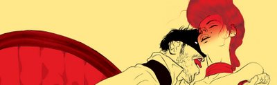
Another recent discovery: Tropical Toxic, the blog of Tomer and Asaf Hanuka, particularly the post on Tomer's amazing (and probably NSFW) cover for the Peguin Classics Marquis de Sade book:
Tangentially, I also discovered that the great David Lapham has started a blog (currently hyping F for Fake, interestingly enough). For those unfamiliar with Lapham: If you're a fan of film noir or crime stories generally, you're still not nearly prepared for the pure nihilism of his genius comic Stray Bullets—depending on what day of the week it is, possibly my favorite comic ever. (His latest, Young Liars, is also off to a fine start.)
(I've been told that including more links makes one's blog posts more google-spider-friendly. Can you tell?)

Another recent discovery: Tropical Toxic, the blog of Tomer and Asaf Hanuka, particularly the post on Tomer's amazing (and probably NSFW) cover for the Peguin Classics Marquis de Sade book:
Tangentially, I also discovered that the great David Lapham has started a blog (currently hyping F for Fake, interestingly enough). For those unfamiliar with Lapham: If you're a fan of film noir or crime stories generally, you're still not nearly prepared for the pure nihilism of his genius comic Stray Bullets—depending on what day of the week it is, possibly my favorite comic ever. (His latest, Young Liars, is also off to a fine start.)
(I've been told that including more links makes one's blog posts more google-spider-friendly. Can you tell?)
Subscribe to:
Posts (Atom)


